Spiritus Vindicta
Spiritus Vindicta came in with a strong atmospheric horror concept, but its original branding was not communicating the tone, quality, or genre clarity the game needed to stand out. The previous identity lacked strong horror positioning, visual cohesion, memorable iconography, storefront readability, and a scalable branding system for marketing and community growth.
The original branding created several major issues: unclear genre signaling, inconsistent visual tone, weak thumbnail and storefront visibility, low emotional impact, and limited scalability across platforms.
The new identity system was built around atmospheric horror, mystery, isolation, and psychological tension. Every visual element was redesigned: a custom horror-inspired logo and wordmark, dark cinematic color palette, recognizable character icon, Steam capsule artwork, achievement icons, social media assets, banners, and scalable branding assets for future marketing.
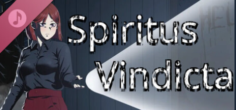
Before The previous branding lacked horror clarity, had inconsistent presentation, felt visually outdated, and struggled to establish a memorable identity.
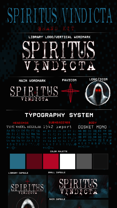
After The new identity created clear horror genre recognition, stronger visual memorability, improved storefront readability, deeper emotional atmosphere, and a more professional overall presentation.
A strong brand identity is more than just a logo — it shapes how players emotionally perceive a game before they ever press play.
Spiritus Vindicta came in with a strong atmospheric horror concept, but its original branding was not communicating the tone, quality, or genre clarity the game needed to stand out. The previous identity lacked strong horror positioning, visual cohesion, memorable iconography, storefront readability, and a scalable branding system for marketing and community growth.
The original branding created several major issues: unclear genre signaling, inconsistent visual tone, weak thumbnail and storefront visibility, low emotional impact, and limited scalability across platforms.
The new identity system was built around atmospheric horror, mystery, isolation, and psychological tension. Every visual element was redesigned: a custom horror-inspired logo and wordmark, dark cinematic color palette, recognizable character icon, Steam capsule artwork, achievement icons, social media assets, banners, and scalable branding assets for future marketing.
Before The previous branding lacked horror clarity, had inconsistent presentation, felt visually outdated, and struggled to establish a memorable identity.
After The new identity created clear horror genre recognition, stronger visual memorability, improved storefront readability, deeper emotional atmosphere, and a more professional overall presentation.
A strong brand identity is more than just a logo — it shapes how players emotionally perceive a game before they ever press play.
Ready to get results like Spiritus Vindicta?
Book a Strategy Call